 In the video game world you always hear a lot of talk about graphics…sprites vs polygons, 1080p, next gen, etc. but what you don’t hear a lot about anymore is box art. As a society, have we finally evolved past judging a book by its cover, or in this case a game by its box art?
I don’t think so; at least I know I haven’t.
In this new written segment, I want to take the skills I’ve developed over my career as an artist and apply them to a randomly selected video game from the Pixelated Audio Music Library. These are just opinions based on my training and personal taste. In the articles I will not be just praising beautiful box art but also analyzing how the art speaks or doesn’t to the viewer and how it works in the context of an initial release, as well as, in having played the games.
This is my critical analysis of the Nintendo Wii The Legend of Zelda: Twilight Princess box art for both the US and Japan. It’s easy to see these are two totally different box art designs with different feelings between the two markets.
Quickly let’s run through a bit of history and facts about the game. The Legend of Zelda: Twilight Princess is the 13th Zelda game in the series developed and published by Nintendo. It was released in November and December of 2006 for both the Wii and GameCube with Eiji Aonuma at the helm as the director of his 3rd and final Zelda game to date (Majora’s Mask, Windwaker) and series creator Shigeru Miyamoto as producer.
I can’t move on without briefly mentioning the three composers for this game. First Koji Kondo who’s responsible for nearly every major Mario and Zelda game as well as many more amazing titles. Next is Toru Minegishi also with several Zelda games under his belt as well as Animal Crossing, Super Mario Sunshine and recent games like Super Mario 3D World and Splatoon. Lastly we have Asuka Ohta and she’s worked on The Legend of Zelda: Spirit Tracks and New Super Mario Bros.
It’s also important to mention some of the art team for this amazingly beautiful game. Satoru Takizawa has worked his way up from a graphic designer on Star Fox 64 to a character design for Majora’s Mask and Ocarina of Time before finally becoming the art director for Windwaker and Twilight Princess, while Yusuke Nakano is responsible for the gorgeous main character design and illustrations.
They obviously didn’t do the art alone so here’s a quick list of other artists involved in Twilight Princess.
Character design – Satomi Asakawa (lead), Michiko Iwasawa, Tomomi Marunami, Tsubasa Sakaguchi, Daisuke Watanabe
Enemy design – Yoshiyuki Oyama (lead), Takafumi Kiuchi, Yasutomo Nishibe, Rikuto Yoshida
Now that we have a few facts established let’s get into the art. Each piece of art has a story to tell, some are better at it than others and some speak differently to each person. I will be viewing these box arts as if I have no prior knowledge of the game and its story. So don’t worry if this game is on your “to play” list, no spoilers. The US Legend of Zelda: Twilight Princess box art (above) shows the game’s classic logo at the top center. Behind this, like many others in the series, we have an image specific to the game. Here you see a wolf and some kind of symmetrical tribal design, its reference to the game is later obvious. Just below the logo you see Link and a wolf, maybe the same from the logo, with the space divided diagonally. Link’s top portion is in gold and the wolf in silver. Lastly we can see the winged Triforce symbol in the center between Link and the wolf.
Right off the bat I feel they’re alluding to a connection between Link and the wolf with the split layout. I feel this is strengthened by the placement of the Triforce symbol in-between them right on the border of silver and gold. Further strengthening the connection is both Link and the wolf have the same earrings.
I understand what the people at Nintendo are going for with this layout but I have some gripes. My biggest one being that Link’s face is looking to our right while the wolf is facing down because of the shape of his head and the diagonal angle. You can see the attempt at symmetry but I feel it’s kind of “off” due to the direction the faces are pointing and is further broken by the wolf’s neck/back of the head not even coming close to lining up with Link’s hat. This could be fixed by shrinking the wolf’s hair or changing the way Link’s hat lays. Here are some quick sketches that I think help address the problems I have with the box art while staying in the strict dual color split layout they’ve selected. These are not perfect solutions and more time could be spent brainstorming possibilities, leaving these as gut reactions to the problems I’ve mentioned.
The dual image, while alluding to the story, lacks excitement and drama. I also feel that the split layout is kind of a lazy way to hint at the connection between the two characters. And with all the game multi-packs and HD remakes that have been coming out with more than one game on the disc (God of War Trilogy, Metal Gear Solid HD Collection, etc.), you usually see multiple games depicted on the box art, most often in some kind of a panel or stripe pattern. This Zelda box art feel more like its two games packaged together than a new original one. Now on to the Japanese box art. With the exception of the same logo as the US it’s very different. This box art feels very dynamic and exciting. It has a much wider value (light and dark range) and also makes much better use of the diagonal layout. Nintendo uses Link in combination with a black diagonal organic shape to create the partition. There is also much more movement and color contrast…so why do I not feel satisfied after a few minutes of looking at this box art, similar to the feeling I would get after eating fast food?
Because this is the fast-food equivalent of a box art, designed for instant gratification. Its like screaming “HERE’S LINK, GIVE ME YOUR MONEY” or to modify a term from the porn industry, it’s the “rupee shot.”
This image gives no hints at the story. Years from now if you remove the logo it will be hard to tell what specific Zelda game this image of Link fits with. When researching for this article I had to do extra work just to make sure this wasn’t a fan made box art design. I myself have made very convincing custom box art for games and thought this might be one, but as I now know this is an official box art design released by Nintendo.
I would like to offer a pair quick mock-ups as possible alternative options for the box art to this game. The first image is a quick sketch I did combining the idea behind the US and Japanese box arts. Keeping the diagonal partition, it depicts Link and the wolf showing a connection between them in a similar way the US box art does. It also is more dramatic and has a more colorful energy like the Japanese version. I also feel it has that instant gratification look but at the same time still has lasting appeal because of the specific connection to this game.
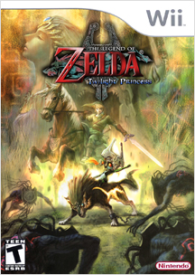 For the second image I took a beautiful official image from the games art by Yusuke Nakano and placed it with a logo and wow…that’s one beautiful box art cover that hints at the story in a colorful and epic way.
I didn’t set out with the intent to talk negatively about the box art or say I know what’s best. I’m an artist and a gamer and this is my way of mixing the two things I’m most knowledgeable and passionate about. Nintendo released two beautiful box arts for The Legend of Zelda: Twilight Princess and it’s out of love that I pick them apart. It, however, was my intent to speak about an over-looked area in games and get people to think about how concept artists, illustrators and graphic designers fit into the spectrum alongside directors, animators, composers and the dozens of talented people that work together to bring us games that shape our thoughts, feelings and lives.
As an artist I understand that many box art designs were pitched but with that said I still feel that out of all of those potential designs the most effective ones, for whatever reason, were not selected for The Legend of Zelda: Twilight Princess.
Thanks for reading! – James
Pixelated Audio – iTunes website facebook twitter
Jame Brunner Artwork – manovermars.com
Triforce Brigade of Zelda – facebook